Roundcube Themes Gone?

I noticed that I cannot change the theme (To Larry) in roundcube, I am on build 120.0.1
Was this feature removed or deeply hidden, as its not under the settings icon anymore.
Thanks
-
I literally just got the new Elastic Roundcube UI forced on me this week. To say it is terrible is an understatement. It is so cluttered and poorly designed. Can we PLEASE GET LARRY BACK! ASAP.
0 -
Two of us here hate the Elastic UI. Nowhere near as clear as previous themes.
I couldn't find a location for specific and detailed review and problem reporting for the Elastic theme. I am happy to put comments on such a thread if one exists.
Issues:
- Selected folders and emails are not clearly highlighted - the contrast difference between selected state and not selected is low and so requires real concentration and constant tilting of screen (or head) to check the right stuff is selected especially before deleting. It is hard to do the right thing so mistakes are more likely. A higher requirement over beauty for a UI is functionality and usability.
- When clearing a folder, typically Rubbish/Trash/Deleted Items, there is a confirmation pop-up but it doesn't spell out the actual folder being cleared. Along with the previous point about selected folder contrast, this is an source of major potential error. (A user here has deleted all their inbox accidentally, though this was with Larry theme. It is just more likely now with the indistinct character of Elastic).
- The layout seems to be inflexible and not as usable as Larry was. The full reasons why aren't obvious but I find a general sense of disorientation and functions not being clear.
0 -
I think part of the problem here goes beyond simply bringing Larry back.
What I really want is a more information-dense, user-configurable inbox.
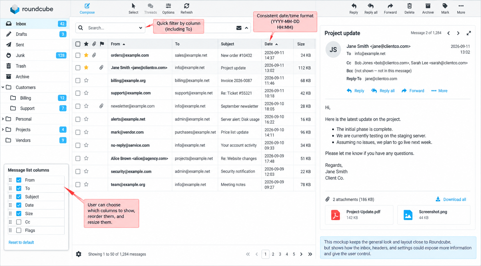
An inbox is fundamentally a list of messages with metadata fields such as From, To, Subject, Date, Size, flags, and so on. Since those fields are not hierarchical, a table is one of the best ways to present them. A table lets the user scan quickly, compare messages easily, and sort or filter by the fields that matter most.
More importantly, the user should be able to decide:
- which fields are shown;
- which fields are hidden;
- the order of the columns;
- the width of the columns;
- which fields receive visual emphasis;
- and how those fields are represented.
Right now, Roundcube’s current design puts too much emphasis on Subject.
When I check email, I am not trying to admire the interface. I am trying to triage messages quickly:
urgent things first, important things second, and the rest maybe later, or maybe never.
The first thing I want to know about an email is who sent it.
If I could only see one field, it would be From.
The reason is practical. Some of the people emailing me are paying me money, and those messages deserve promptness. So any UI that gives more emphasis to Subject than From is working against the way I actually process email.
For me, From should visually jump out first.
Also, I do not just want to see who the message is from. I often want to see the actual email address more than the friendly label.
Modern email clients seem to assume the display name is more important, but for me it often is not.
For example, I would often rather see:
than:
Example Store
I have been using email since 1993, and the actual address often tells me more than the label does. The address helps me quickly recognize domains, role accounts, billing addresses, support addresses, automated systems, and suspicious lookalike senders.
So I would like the user to be able to choose whether From displays:
- display name only;
- email address only;
- display name + email address;
- or email address + display name.
My own preference is email address first.
The same issue applies to To.
I have multiple server-side email addresses feeding into the same inbox. They are not interchangeable. Some are for customers. Some are for billing. Some are aliases. Some are addresses I fully expect to attract more spam than others.
In fact, one way I manage spam is by eventually retiring an address that has become too contaminated.
That means the To field is important to me at a glance. I want to be able to look at a message and immediately see which of my addresses it was sent to.
A mail client should not presume that To is basically the same all the time just because everything lands in one inbox.
For my workflow, To should be a first-class field in the inbox, not hidden away as an afterthought. I want to be able to show it as a column, sort by it, and filter by it directly.
For example, I should be able to filter the inbox to:
To = sales@example.com
and instantly see everything that went to that address.
That is useful not only for organization, but also for deciding when a particular address has accumulated so much spam that I should stop using it.
Another thing I dislike is how modern interfaces try to be “helpful” with dates and times by constantly changing how they are displayed.
I do not like seeing dates represented as:
Today
Yesterday
Tuesdayor a time by itself when the message is from today.
I prefer a consistent and unambiguous format, such as:
2026-09-11
14:37In other words, YYYY-MM-DD and then a zero-padded 24-hour time, ideally on a second line if needed to keep the column narrow.
That format is compact, consistent, unambiguous, and sorts properly. It also does not keep changing its appearance depending on when I happen to look at the inbox. The underlying data did not change, so I do not want the presentation changing from a time, to Yesterday, to a weekday, and then eventually to a date.
If other users prefer friendlier date formats, that is fine. Make it a preference. But I want consistency.
There is also a related problem in the message-reading view.
Modern UIs try to be elegant by hiding message details by default. I do not want that.
I want to see the message metadata all the time without having to click a “details” control.
When I open a message, I want the addressing information visible immediately, including:
- From
- To
- Cc
- Bcc where available
- Reply-To if present
- Date
I do not want to trade useful information for elegance.
Who else received the message is pertinent information. If a message included Cc recipients, that affects how I interpret the conversation and whether I need to respond. Reply-To can be important too. If Bcc information is available in the context I am viewing, I want to see that as well.
In general, I would rather have a slightly less elegant interface that consistently shows me the data than an elegant interface that keeps making me ask for the data.
That is really the common thread through all of my objections to the current design.
The UI keeps deciding for me:
- that Subject should be emphasized more than From;
- that display labels should replace actual email addresses;
- that To is secondary information;
- that dates should be translated into cute relative labels;
- and that message metadata should be collapsed by default.
Those choices may look cleaner, but they remove information I actually use to process email.
What I would like instead is a configurable inbox table that lets the user:
- choose visible columns;
- hide unwanted columns;
- reorder columns;
- resize columns;
- sort by clicking column headers;
- filter directly by column values;
- choose which fields receive stronger visual emphasis;
- choose whether From and To show names, addresses, or both;
- choose a consistent date/time format;
- and choose whether message headers are compact or always expanded.
This is why I say the issue is bigger than just wanting Larry back.
I do not necessarily need Larry itself back.
What I need is the capability that Larry supported better: an information-dense, user-configurable inbox where the user decides what information deserves attention first.
Also, to make my point clearer, I am not suggesting a totally different application or a radical redesign. I think this could stay visually close to Roundcube’s current design and still become much more useful. The overall layout, folders, toolbar, and preview pane can remain familiar. The important change is to make the message list behave more like a proper configurable table, and to stop hiding information that some users want visible all the time.
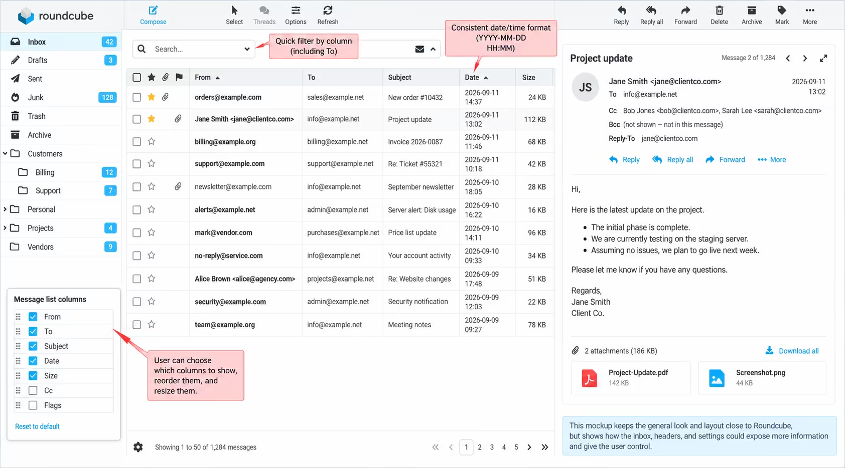
Here is a mockup of how I’d like it to be:
To zoom into this image, without restriction from this UI, view it here:
https://neartalk.com/ss/emailMockUp.avif0 -
If I could agree with this more than 100% I would.
I do have this exact address - To = sales@example.com it was picked up by spammers as it is on my web site and now I get a horde of Luxury Watch eMails and I love your profile, you are so a cute man email junk in this box.
But not know what the e-maill account is from I still need to click on them to see if it is real or not.
I like the vertical form of LARRY better than the 3 columns used in elastic. I have a large screen monitor. with LARRY the reading window was center screen Elastic or what ever it is called puts the reading wind over on the left half of the monitor and no longer centered in from of the user. People should not be forced to mover or change focus to read an email. Larry everything was vertical top and bottom
Mat <sales@example.com> just shows up as Mat in the inbox list now and then the subject line, I need to quickly sort out the trash, with out opening them in a side panel letting the scammers and bots know that I opened the message just adding to more spam into my sales account email. This email is only posted on my business sigh and is for sales only, but now it has become a day of frustration sorting it. This was never a problem with Larry0 -
Is anyone listening to us? Clearly its not been a popular decision to get rid of Larry without replacing it with something just as functional.
I think I'll be searching for alternatives because even after a few months I still really dislike Elastic with a passion.
Any suggestions?
1 -
It seem Cpanel is not attending to the request. There is no response and nothing has done so far.
Is there anyway to escalate this as some users started the request 2 years ago.
Anyone from Cpanel is looking into this matter?
0 -
I will answer for cPanel. I am not affiliated with webpros/whm/cpanel. For clarity, Larry is a skin/theme for RoundCube. cPanel stopped supporting the Larry email theme because it was deprecated upstream by the Roundcube development team. This just means that they stop updating it, fixing bugs and security issues.
You can still install it if you have SSh access to your server. However, this is a very insecure thing to install. As it has not been updated for 5 years. There are a few solutions to get the Larry theme back on cPanel. Set up a GITHUB account and help update the theme. Or fork it and update that, then see if cPanel will include your forked/updated version.
https://github.com/roundcube/larry
Either way you will be responsible for keeping it up to date, for free.
0 -

I'm going to go ahead and lock this thread. It's been over 2 years and everything that could possibly be said has already been said.
0
Post is closed for comments.
Comments
98 comments