Site builder AI - Adjustment web page according to the screen size

-
Hi,
Just to clarify — are you using SiteJet Builder or a different application called SiteBuilder?
If you're working with SiteJet Builder, the themes are generally responsive by default across most devices. You can find more details in the following guide:
https://help.sitejet.io/hc/en-us/articles/24275878741015-Responsiveness
Please note that SiteBuilder appears to be a third-party application that is separate from SiteJet Builder and is not currently supported by cPanel.
0 -
Well I'm not sure, because to get help I first contacted Sitejet studio support who told me that it was not his software because the interface is different (see photos).
My host then advised me to contact cPanel by telling me that they are the ones who make this software available on their platform; but I can't contact them directly, that's why I'm here...
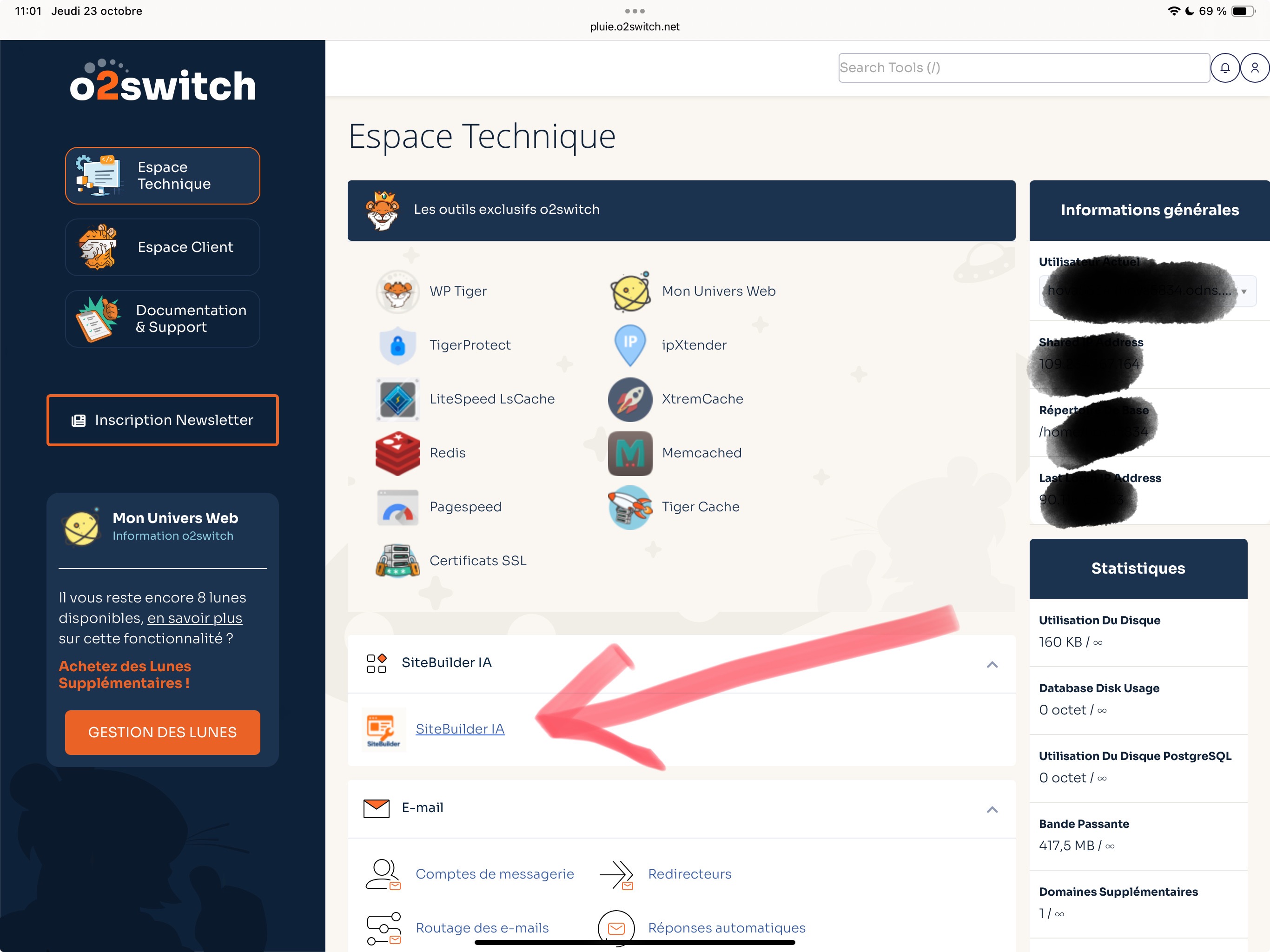
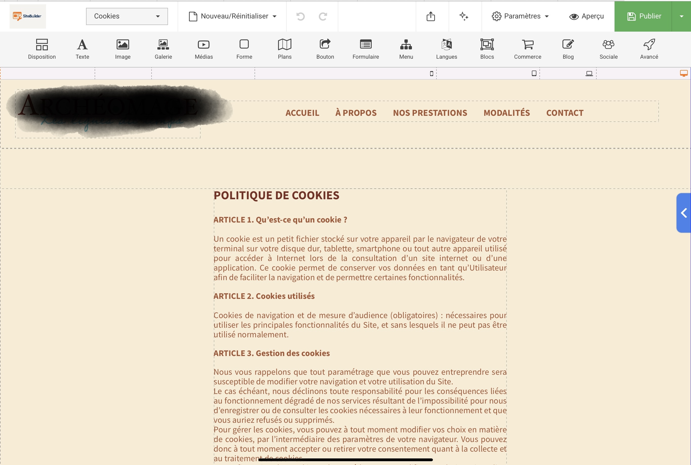 0
0 -
Hi,
Thanks for the update! It appears you're currently using SiteBuilder AI, which is a separate platform from SiteJet Builder. I recommend letting your hosting provider know that this is a custom installation and not part of the standard cPanel setup as we are only affiliated with SiteJet Builder.
Whoever installed the application—such as your system administrator or service provider—should be able to point you in the right direction for support with SiteBuilder AI.
0 -
Ok, thank you very much for your help ! :)
0 -
I’ve faced this issue with Sitebuilder AI too. It doesn’t allow for independent edits for each screen size, so changes on desktop often affect tablet and phone layouts. You could use “Visibility” or “Hide on device” options to create separate versions of elements for each screen size. It’s a bit of a workaround, but it can help you manage the layouts better.
0 -
Hey,
The AI site builder usually creates a responsive layout, but some manual tweaking is almost always needed. You’ll want to check spacing, font sizes, and section widths for different screen sizes.Try switching between desktop, tablet, and mobile preview modes. Sometimes the AI uses fixed widths or positioning that don’t work well on smaller screens. If a section still doesn’t adjust properly, rebuilding that block with standard responsive elements usually fixes it.
AI tools are good for getting started, but final responsiveness still needs a bit of manual adjustment.
Hope this helps.
0
Please sign in to leave a comment.
Comments
6 comments